
Form Fundamentals
An often overlooked UI element, forms serve a critical function in websites and apps, and deserve thoughtful consideration. While design systems make it simple to craft visually stunning information collectors, creating forms that are usable and useful require a more strategic approach.
An exchange of information

The forms in Tendril 360 are comprised of elements defined in a comprehensive platform-wide design system.
Forms facilitate an exchange of information between a user and the form’s recipient. I say this because, any time a designer presents a user with a form, we are asking for their time and attention, and we’d better be providing something of value to them in return. The higher the perceived value of the reward, the more complex or personal the form can be.

In this example, created to help Customer Success Representatives understand and manage household data at the individual level, the screens pictured provide an at-a-glance view of a customer’s energy use, and directs program enrollment and energy saving action recommendations through the Next Best Action engine. While general information is available for any customer who calls in, customers who provide updated premise information and or additional details for their home profile are able to receive much more personalized assessments of their energy use as well as tips and programs that are directly relevant to the details they have provided.
2. A clear, staged flow

For forms to be useful to their recipient, they must be complete and accurate. That means that they must hold the user’s attention and minimize the potential for human error.
When the volume of information being collected is rather hefty, it’s helpful for the information to be requested in stages. In this example, Uplight’s Demand Response Management System (DRMS) requires detailed inputs about the locations, devices, date and time, and impact forecast for load shifting events. In order to limit cognitive load, we broke the information inputs into a three step flow that dynamically adds fields based on the options selected and updates the event impact forecast based on the information that the user inputs.
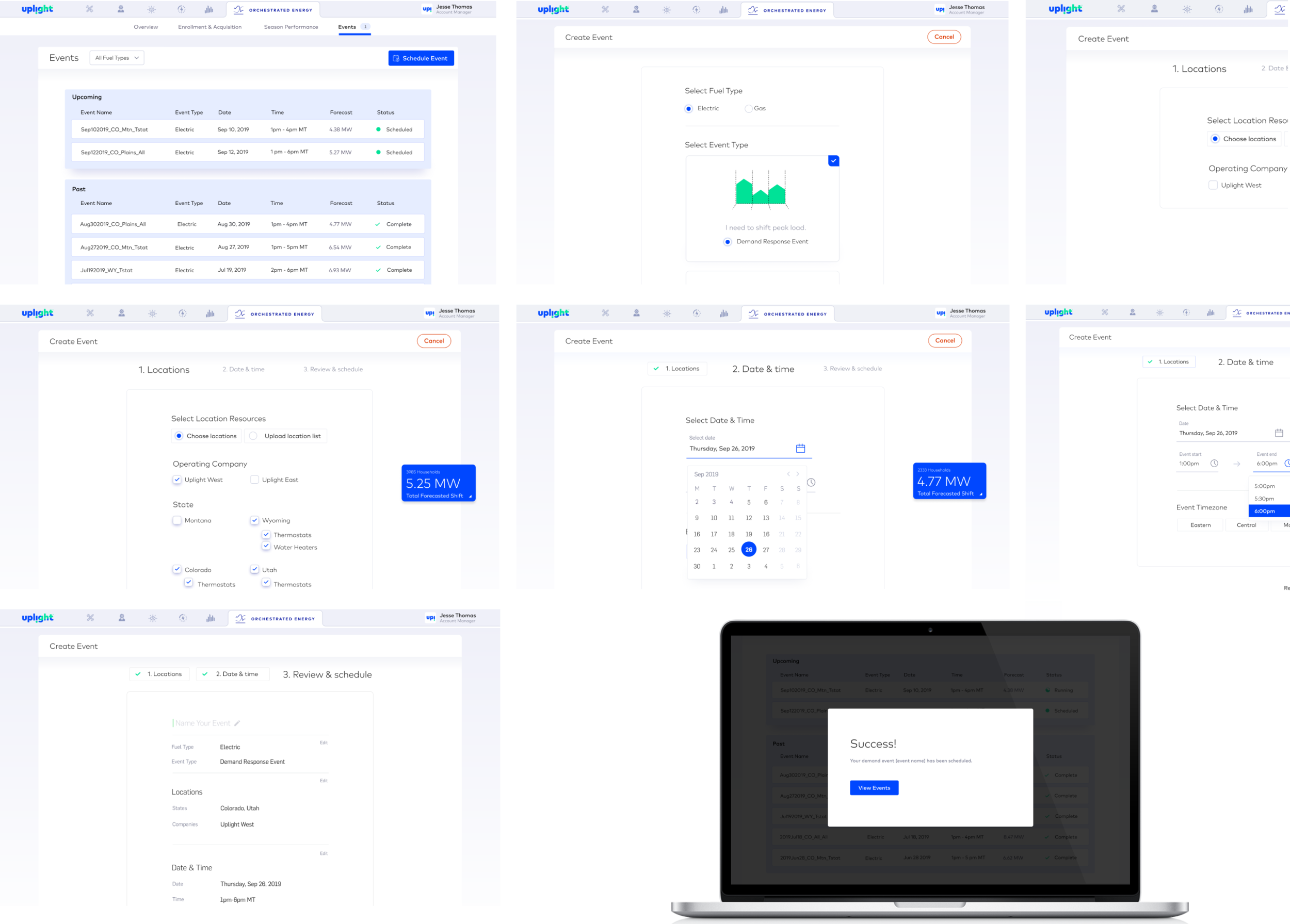
Staging the collection of information allows the user to focus on a single task at a time, reducing missed fields and incorrect entries. A final review screen at the end of the flow lets the user review the selections they have made holistically (and edit them, if needed) prior to submitting the form.
3. Ease of use
More than anything else, it’s critical that the form fields themselves be simple to use. Clear focused states, field options that match the information being requested, and obvious error states that provide clear instructions for correction all contribute to making a form easy and intuitive to use.
